Contextual Upgrades
It’s hard to know exactly what you’ll need when you start the tax filing process.
In the DIY online tax space, most users start off with the base product — Free Online. As a user begins filing and H&R Block learns more about their tax situation, some users will need to purchase a different product to file their taxes accurately. That’s where my role came into play.
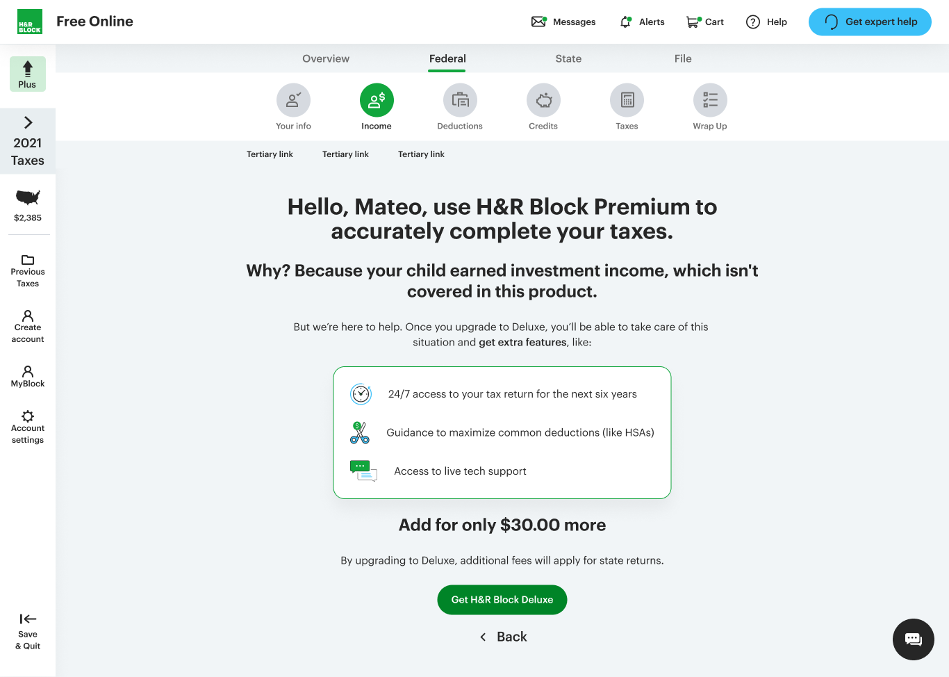
This is how a typical contextual upgrade in H&R Block Online used to look.
-
Historically, contextual upgrades have been a hard selling point in the tax filing space. Users detest needing to pay to file their taxes and H&R Block experiences quite a bit of dropoff at those decision points.
-
Users resent the idea that they need to pay (more) to file their taxes. We found out through user testing that, excluding price, the biggest pain points for users are the tone of the copy and the overwhelming design of the page.
-
In response, the product manager, a UX designer, and I put our heads together to create content and design changes that answered the users’ biggest concerns.
Example 1: Before and after
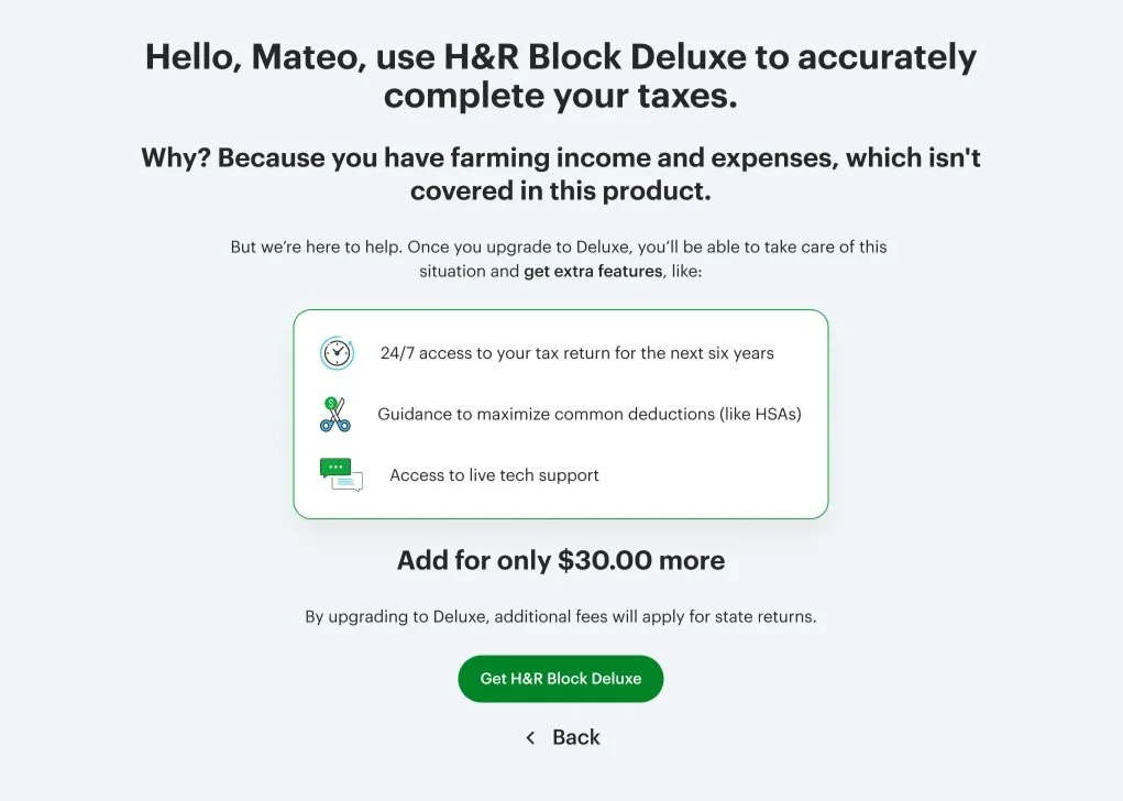
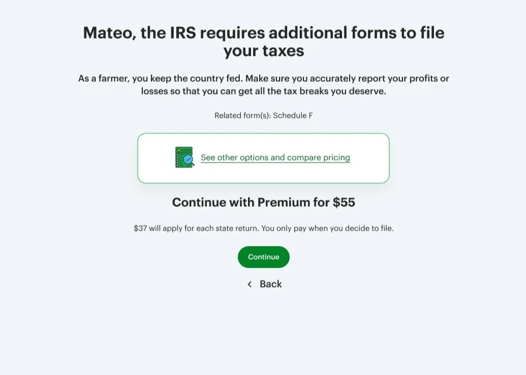
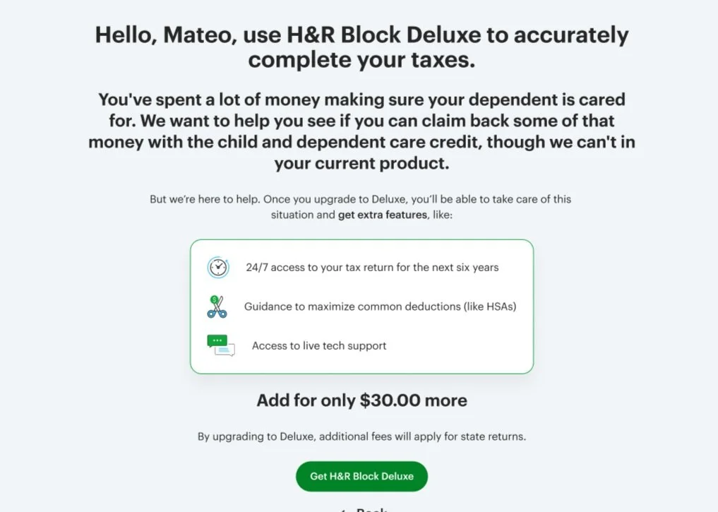

Example 2: Before and after
What I did:
Starting with the header, users did not appreciate H&R Block’s use of “accurately.” It cast doubt on the quality of the free product overall. To shift perceptions while remaining truthful, we decided to lean heavily into the fact that it isn’t H&R Block that requires these forms, but the IRS.
In the subheader, there’s a negative association with the phrase “…which isn’t covered in your current product.” To turn this around, we let the primary header do the lifting with its IRS requirement phrasing. This shifted perspectives and tested well with users.
I found the body copy to be unnecessary because users mostly glossed over it or just didn’t read it. So we removed it.
The value propositions in the before images got mixed reactions, but some users found it helpful. However, most users wanted to know more about what they got and explore their options. So, we created a new page with a full comparison of our products.